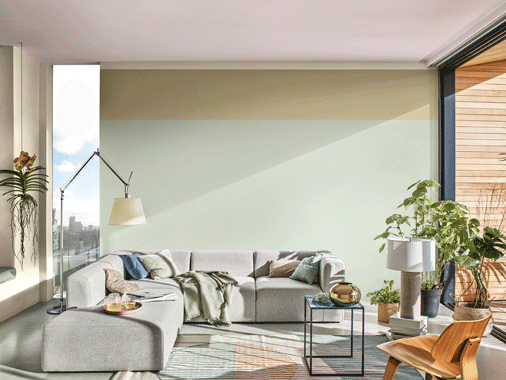
Tranquil Dawn is AkzoNobel’s Color of the Year for 2020.
The culmination of extensive trend research by experts around the world, it is designed to capture the essence of what makes us human as the dawn of a new decade arrives.
A delicate, fluid shade somewhere between green, blue and grey, Tranquil Dawn features in all four of the company’s ColourFutures 2020 palettes.
They’re designed to empower and inspire customers and make the task of choosing colour easier.
"Tranquil Dawn perfectly captures the 2020 mood of what makes us human,” explained Heleen van Gent, Head of AkzoNobel’s Global Aesthetic Center, which leads the annual trend research.
"It’s reminiscent of the colours of the morning sky and encapsulates our desire to treasure our most human qualities, which we’ll need in the new decade we are entering.
"It’s an exciting and inspiring way for us to share our passion for paint with the world.”
Specialists from the company’s paints and coatings businesses work with leading design professionals to study the annual trend research findings.
The colours are then translated for use with specific products to offer on-trend selections to customers in various markets.
It’s a prime example of the importance AkzoNobel attaches to investing in colour expertise across all of its activities.
"The research we carry out is designed to enable the latest trends to be applied in all relevant areas of our paints and coatings businesses,” added David Menko, AkzoNobel’s Chief Marketing Officer.
"Our design teams translate the information to market-specific colours and finishes for various segments, including automotive, architecture, consumer electronics and wood.”
For homes and decorative paints in particular, the four related 2020 colour palettes meet a series of specific needs, such as creating a home for play, while also enabling consumers to express themselves.
Divided into separate themes, the palettes are known as The Care Palette, The Play Palette, The Meaning Palette and The Creativity Palette.
The beauty of the annual research means the same palettes can be applied to other businesses where colour plays an important role – most notably Automotive and Specialty Coatings, Powder Coatings and Wood Coatings.
"Our Automotive and Specialty Coatings business in particular makes full use of the trend research to create corresponding colour palettes across various segments, such as consumer electronics, automotive and aerospace,” explained Menko.
"A unified colour and trend development process also helps our Wood Coatings and Powder Coatings businesses to successfully launch and leverage their own trending colors and accompanying palettes across all markets.”


